
Getting to grips with CSS: A Beginner’s Tutorial (Part 2)
Cascading Style Sheets (CSS) is a fundamental technology for web development, allowing you to control the presentation and layout of your HTML documents. This tutorial is designed for beginners who want to get started with CSS. We’ll cover the basics, common styling properties, and provide practical examples to help you understand and apply CSS to your web projects.
This tutorial continues from Part 1
Prerequisites
- Basic knowledge of HTML (you should be familiar with HTML tags and their structure).
4. Box Model
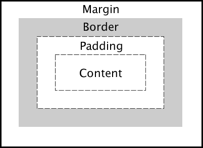
4.1 Box Model Overview
The CSS Box Model is a fundamental concept that describes the layout of an element on a webpage. It consists of content, padding, border, and margin.
- Content: The actual content of the element.
- Padding: Clear space between the content and the border.
- Border: A border surrounding the padding.
- Margin: Clears space outside the border.
4.2 Margin, Border, Padding, and Content
Setting Margins
Use the margin property to set the space outside an element.
Example:
div {
  margin: 10px;
}
Setting Padding
Define space between an element’s content and its border using the padding property.
Example:
div {
  padding: 20px;
}
Setting Border
Specify the border properties, including width, style, and color, using the border property.
Options for the style property are:
- none: Default value. Specifies no border.
- hidden: The same as “none”, except in border conflict resolution for table elements.
- dotted: A dotted border.
- dashed: A dashed border.
- solid: A solid border.
- double: A double border.
- groove: A 3D grooved border. The effect depends on the border-color value.
- ridge: A 3D ridged border. The effect depends on the border-color value.
- inset: A 3D inset border. The effect depends on the border-color value.
- outset: A 3D outset border. The effect depends on the border-color value.
- initial: Sets this property to its default value.
- inherit: Inherits this property from its parent element.
Example:
div {
  border: 1px solid #ccc;
}
4.3 Box Sizing
The box-sizing property determines how the total width and height of an element are calculated. The default is content-box, which only includes the content, but you can use border-box to include padding and border in the total width and height.
This can be useful when you are building a responsive layout with a grid of elements, and you want to ensure that the elements’ dimensions remain consistent regardless of any padding or borders applied.
Example:
div {
  box-sizing: border-box;
}
5. Positioning and Layout
5.1 Position Property
The position property in CSS is used to control the positioning of an element within its containing element. The values it can take are:
-
static(default): The element is positioned according to the normal flow of the document. This is the default behavior. -
relative: The element is positioned relative to its normal position. It still occupies space in the normal flow, but you can adjust its position using properties like top, right, bottom, and left. -
absolute: The element is positioned relative to its nearest positioned ancestor. If no positioned ancestor is found, it is positioned relative to the initial containing block (usually the viewport). -
fixed: The element is positioned relative to the viewport. It does not move when the page is scrolled. -
sticky: The element is treated as relative positioned until it crosses a specified point during scrolling, at which point it becomes fixed.
Example:
/* Relative Positioning */
div {
  position: relative;
  top: 10px;
  left: 20px;
}

/* Fixed Positioning */
header {
  position: fixed;
  top: 0;
  left: 0;
  width: 100%;
  background-color: #333;
  color: #fff;
}
5.2 Z-Index property
The z-index property in CSS is used to control the stacking order of positioned elements along the z-axis (the axis perpendicular to the screen). It determines which elements appear in front or behind other elements on the webpage.
Example:
/* Positions the element with a higher z-index on top of others */
.higher-z-index {
  z-index: 2;
}

/* Positions the element with a lower z-index behind others */
.lower-z-index {
  z-index: 1;
}
Usage Tips:
Stacking Context: The z-index property only works on elements with a position value other than static (the default). Elements with a higher z-index are stacked on top of elements with lower values within the same stacking context.
Integer Values: The z-index value is an integer, and its actual value is relative to the stacking context it is in. Higher values move elements to the top of the stack.
Negative Values: Negative values are allowed, and elements with negative z-index values are stacked below elements with zero or positive values.
Example:
<div class="lower-z-index"></div>
<div class="higher-z-index"></div>
/* Stacks the element with a higher z-index on top of the element with a lower z-index */
.lower-z-index {
  position: relative;
  z-index: 1;
  background-color: #ff0000;
  width: 100px;
  height: 100px;
}

.higher-z-index {
  position: relative;
  z-index: 2;
  background-color: #00ff00;
  width: 100px;
  height: 100px;
}
In this example, the element with the class higher-z-index will appear on top of the element with the class lower-z-index due to its higher z-index value.
5.3 Overflow Property
The overflow property in CSS is used to control how content that overflows the box of an element is handled. It is particularly useful when dealing with elements that have a fixed size and might contain more content than can be displayed within that size.
Example:
/* Hides the overflow content and displays a scrollbar */
.overflow-container {
  width: 200px;
  height: 100px;
  overflow: auto;
}
Common Values:
-
visible(default): Content that overflows the box is rendered outside the box. This may cause content to overlap with surrounding elements. -
hidden: Overflowing content is clipped, and the user won’t see it. This can lead to content being partially or completely hidden. -
scroll: Adds a scrollbar to the box, allowing the user to scroll and see the hidden content. -
auto: Behaves likescrollif overflow occurs, otherwise, it behaves likevisible. A scrollbar is added only if needed.
Example:
<div class="overflow-container">
  <!-- Content that might overflow the fixed-size container -->
  Lorem ipsum dolor sit amet, consectetur adipiscing elit.
  Quisque euismod turpis sit amet tortor ultricies luctus.
</div>
/* Applies overflow auto to the container */
.overflow-container {
  width: 200px;
  height: 100px;
  overflow: auto;
  border: 1px solid #ccc;
}
In this example, the overflow property is set to auto for the .overflow-container class. If the content exceeds the fixed dimensions of the container, a scrollbar will appear, allowing the user to scroll and view the hidden content.
5.4 Display Property
The display property in CSS determines how an HTML element should be rendered in the document. Different values of the display property dictate the layout behavior and how elements interact with each other.
Understanding the display property and its values is essential for creating well-structured layouts in CSS.
Block-Level Elements
display: block;
Block-level elements generate a block box in the document flow, causing a line break before and after the element. This is used for structural elements to create sections of a page with distinct visual blocks.
Examples: <div>, <p>, <h1>, <ul>, <li>
Inline Elements
display: inline;
Inline elements do not start on a new line; they flow in between the content. They only take up as much width as necessary to fit their content; setting a width or height on an inline element also has no effect. margin-top and margin-bottom also have no effect on the element. This is used for text-level elements.
Examples: <span>, <a>, <strong>, <em>, <img>
Inline Block Elements
display: inline-block;
Combines features of both block-level and inline elements. It generates a block-level box but does not force a new line. This is used for creating elements that participate in inline flow but can have block-like styling (they can have heights and widths, and they respect top and bottom margins).
For example, take an unordered list:
<ul>
  <li>one</li>
  <li>two</li>
  <li>three</li>
</ul>
With default settings, each li element will display on a new line, like so:
- one
- two
- three
After applying a style that changes the display property to inline-block
li {
  display: inline-block;
}
…the same elements will display inline:
one two three
Update the style to include a width and the items take on new widths:
li {
  display: inline-block;
  width: 50px;
}
one two three
Flexbox
display: flex;
Establishes a flex container and enables the use of flex properties on its children. Flexbox is a one-dimensional layout model, allowing you to distribute space along a single axis.
.container {
  display: flex;
  justify-content: space-between;
}
Grid Layout
display: grid;
Establishes a grid container and allows you to use grid properties on its children. Grid Layout is a two-dimensional layout model, providing both row and column flexibility.
.container {
  display: grid;
  grid-template-columns: repeat(3, 1fr);
  gap: 10px;
}
5.5 Flexbox and Grid Layout
Flexbox and Grid Layout are powerful CSS layout models that simplify the design of complex layouts.
Flexbox
Flexbox is a one-dimensional layout model that allows you to design complex layouts more efficiently. It provides an easy way to distribute, space and align items within a container along a single axis—either horizontally or vertically. Flexbox relies on a flex container and its child elements (flex items).
Flex Container
display: flex;ordisplay: inline-flex;defines a flex container.flex-direction:Defines the direction of the main axis (row,row-reverse,column,column-reverse).justify-content:Aligns flex items along the main axis.align-items:Aligns flex items along the cross axis (perpendicular to the main axis).
.container {
  display: flex;
  justify-content: space-between;
}
Flex Items
- The
flex-basisproperty sets the initial main size of a flex item. It sets the size of the content box unless otherwise set with box-sizing. The flex-basis property is specified as either the keywordcontentor a width (e.g. 10em, 3px, 50%, auto). - The
flex-growproperty sets the flex grow factor, which specifies how much of the flex container’s remaining space should be assigned to the flex item’s main size. When the flex-container’s main size is larger than the combined main sizes of the flex items, the extra space is distributed among the flex items, with each item growth being their growth factor value as a proportion of the sum total of all the container’s items’ flex grow factors. The flex-grow property is specified as a single number. - The
flex-shrinkproperty sets the flex shrink factor of a flex item. If the size of all flex items is larger than the flex container, items shrink to fit according to flex-shrink. The flex-shrink property is specified as a single number. - The
flexproperty is a shorthand for theflex-basis,flex-growandflex-shrinkproperties. The value can be - A keyword;
auto(The item is sized according to its width and height properties, but grows to absorb any extra free space in the flex container, and shrinks to its minimum size to fit the container. This is equivalent to settingflex: 1 1 auto),initial(The item is sized according to its width and height properties. It shrinks to its minimum size to fit the container, but does not grow to absorb any extra free space in the flex container. This is equivalent to settingflex: 0 1 auto) ornone(The item is sized according to its width and height properties. It is fully inflexible: it neither shrinks nor grows in relation to the flex container. This is equivalent to settingflex: 0 0 auto). - A single number value representing the flex-grow (e.g.
flex: 2;), giving flex-basis a 0 value. - A single width/height value representing the flex-basis (e.g.
flex: 30%;). - Two values representing flex-grow and flex-basis (e.g.
flex: 1 30px;). - Two number values representing flex-grow and flex-shrink (e.g.
flex: 2 2;). - Three values representing flex-grow, flex-shrink and flex-basis (e.g.
flex: 2 2 10%;). - The
flex-wrapproperty sets whether flex items are forced onto one line or can wrap onto multiple lines. If wrapping is allowed, it sets the direction that lines are stacked. Values are;nowrap(flex items are laid out in a single line which may cause the flex container to overflow. This is the default value.),wrap(flex items break into multiple lines),wrap-reverse(behaves the same as wrap but cross-start and cross-end are permuted).
.item {
  flex: 1;
  margin: 10px;
}
Grid Layout
Grid Layout is a two-dimensional layout system that enables you to create grid-based designs. It divides a container into rows and columns, allowing precise control over the placement and sizing of items.
.container {
  display: grid;
  grid-template-columns: repeat(3, 1fr);
  gap: 10px;
}

.item {
  grid-column: span 1;
}
6. Responsive Design
Responsive design ensures that your web pages look good on a variety of devices and screen sizes. CSS media queries allow you to apply styles based on the characteristics of the user’s device.
6.1 Media Queries
Media queries use the @media rule to conditionally apply CSS styles. They can target various features like screen width, height, device orientation, and more.
Example:
/* Default Styles */
body {
  font-size: 16px;
}

/* Media Query for Smaller Screens */
@media (max-width: 600px) {
  body {
    font-size: 14px;
  }
}
6.2 Responsive Units (vw, vh, %)
Responsive units like vw (viewport width) and vh (viewport height) allow you to specify sizes relative to the viewport.
Example:
/* Responsive Font Size */
h1 {
  font-size: 4vw;
}

/* Responsive Container Width */
.container {
  width: 80%;
  margin: 0 auto;
}
6.3 Flexibility with Flexbox and Grid
Flexbox and Grid Layout are excellent tools for creating responsive and flexible designs. They automatically adjust based on available space.
Example (Flexbox):
/* Flex Container */
.container {
  display: flex;
  flex-wrap: wrap;
  justify-content: space-around;
}

/* Flex Item */
.item {
  flex: 1 0 30%; /* Flex-grow, flex-shrink, flex-basis */
  margin: 10px;
}
Example (Grid Layout):
/* Grid Container */
.container {
  display: grid;
  grid-template-columns: repeat(auto-fill, minmax(250px, 1fr));
  gap: 10px;
}
Responsive design is crucial for providing a positive user experience across a wide range of devices. In the next part (Part 7), we’ll explore transitions and animations to add dynamic behavior to your web pages.
7. Transitions and Animations
7.1 CSS Transitions
Transitions allow you to smoothly change property values over a specified duration. They are often used for hover effects or state changes.
Example:
/* Add a Transition to the Color Property */
button {
  background-color: #3498db;
  color: #fff;
  transition: background-color 0.3s ease;
}

/* Change Color on Hover */
button:hover {
  background-color: #2980b9;
}
7.2 CSS Animations
CSS animations provide more complex and dynamic movement. Keyframes define the animation’s behavior at various points in time.
Example:
/* Define Keyframes for Bouncing Animation */
@keyframes bounce {
  0%, 20%, 50%, 80%, 100% {
    transform: translateY(0);
  }
  40% {
    transform: translateY(-20px);
  }
  60% {
    transform: translateY(-10px);
  }
}

/* Apply Bouncing Animation to an Element */
div {
  animation: bounce 1s infinite;
}
8. Common CSS Challenges and Solutions
8.1 Cross-browser Compatibility
Cross-browser compatibility is crucial. Test your website on different browsers to ensure consistent rendering. You can check browser compatibility for certain features using the MDN CSS docs. When reading about a particular feature you will find a ‘Browser Compatibility’ table at the bottom of the page, showing which versions of each each browser have support for the feature. Another great resource is caniuse.com, which has a search box for a feature name and shows nicely present browser compatibility results, including data for the percentage of web users who are using a browser that supports the feature.
Consider using a CSS reset or normalize stylesheet to establish a consistent baseline.
Reset Stylesheet
A reset stylesheet is used to normalize styles across different browsers by removing default styling. It helps create a consistent baseline for styling, reducing browser inconsistencies.
Example reset stylesheet:
/* Reset Stylesheet */
html, body, div, span, applet, object, iframe, h1, h2, h3, h4, h5, h6, p, blockquote, pre, a, abbr, acronym, address, big, cite, code, del, dfn, em, img, ins, kbd, q, s, samp, small, strike, strong, sub, sup, tt, var, b, u, i, center, dl, dt, dd, ol, ul, li, fieldset, form, label, legend, table, caption, tbody, tfoot, thead, tr, th, td, article, aside, canvas, details, embed, figure, figcaption, footer, header, hgroup, menu, nav, output, ruby, section, summary, time, mark, audio, video {
  margin: 0;
  padding: 0;
  border: 0;
  font-size: 100%;
  font: inherit;
  vertical-align: baseline;
}

/* Apply a Box Sizing Border Box to Everything */
* {
  box-sizing: border-box;
}

/* Remove List Styles for Unordered and Ordered Lists */
ol, ul {
  list-style: none;
}

/* Modernizr Placeholder Style Fix */
input[type="text"]::-webkit-input-placeholder {
  color: inherit;
}
input[type="text"]::-moz-placeholder {
  color: inherit;
}
input[type="text"]:-ms-input-placeholder {
  color: inherit;
}
input[type="text"]:-moz-placeholder {
  color: inherit;
}
Normalize Stylesheet
A normalize stylesheet is an alternative to reset stylesheets. It aims to make default styles consistent across browsers rather than removing them entirely. Normalize.css is a popular library that achieves this goal.
Example normalize stylesheet:
/**
 * 1. Correct the line height in all browsers.
 * 2. Prevent adjustments of font size after orientation changes in iOS.
 */
html {
  line-height: 1.15;
  -webkit-text-size-adjust: 100%;
}

/**
 * Remove the margin in all browsers.
 */
body {
  margin: 0;
}

/**
 * Add the correct height in Firefox.
 */
hr {
  height: 0;
}

/**
 * Add the correct text decoration in Chrome, Edge, and Safari.
 */
abbr[title] {
  text-decoration: underline dotted;
}

/**
 * Add the correct display in all browsers.
 */
mark {
  background-color: #ff0;
  color: #000;
}
8.2 Centering Elements
Centering elements horizontally and vertically can be achieved using various techniques, including flexbox and grid layout. Here’s an example using flexbox:
.container {
  display: flex;
  justify-content: center;
  align-items: center;
  height: 100vh;
}
8.3 Creating Responsive Navigation
For responsive navigation, use media queries to switch between different layouts. Consider using a mobile-first approach and hiding/showing navigation items as needed.
Example:
/* Default Navigation Styles */
nav {
  display: flex;
}

/* Media Query for Smaller Screens */
@media (max-width: 600px) {
  nav {
    flex-direction: column;
  }
}
With these tools and solutions, you can tackle common challenges and enhance the functionality and aesthetics of your web pages.
If you have any specific questions or if there’s a particular topic you’d like to explore further, don’t hesitate to ask. Happy coding!